IRPIE Data Visualizations
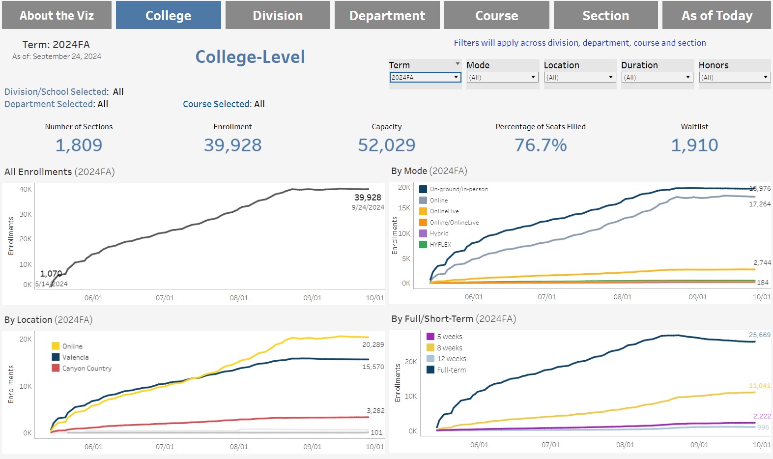
Daily Enrollment
Detailed enrollments showing fill-rates from registration date to end of term. Data refresh daily by 7am.
Section Offerings & Enrollment
The Section Offerings and Enrollment visualization provides annual and term enrollment
and section count data by the college as a whole, division/school and department.
In addition, filters provide the ability to view the data by semester, term/year, location,
Instruction modality, open-educational resources (OER) status, whether the course is a
General Education (GE) requirement for California State University (CSU) or
Intersegmental General Education Transfer Curriculum (IGETC).
Data are refreshed annually in the fall for the prior academic year.
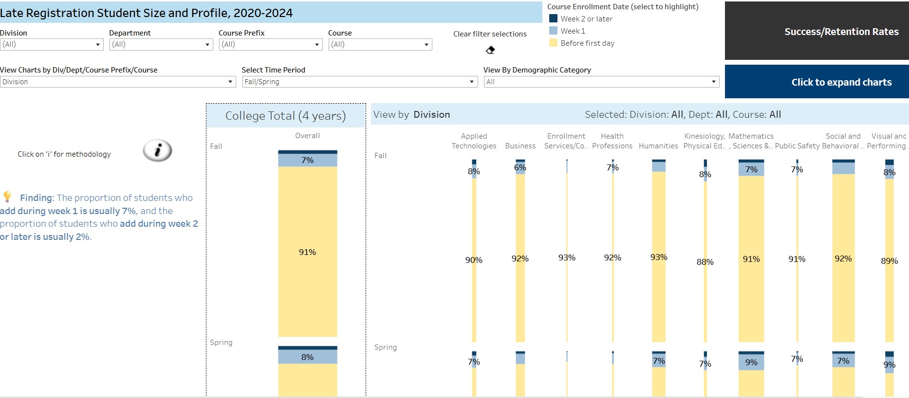
Enrollment Date Effects on Success/Retention Rates Visualization
Program Majors & Awards
This visualization provides data on elements required for program review. Award earner demographics (degrees/certificates) and Programs of study (Majors across fall terms). Data for Awards are refreshed in September for the preceding year, and data for majors are refreshed in current fall term.
Video Tutorials:
Award Earner Demographics, Program Majors Demographics Fall Terms
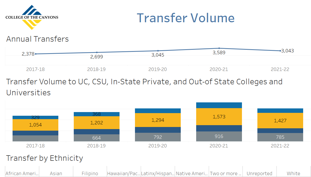
Transfer Volume
This visualization provides information on number of students transferring to various four-year institutions since 2011 through fall 2024.The data are disaggregated by demographics and by the type of four-year institution (e.g. CSU vs. UC).
Video Tutorials:
Annual All Student Profile
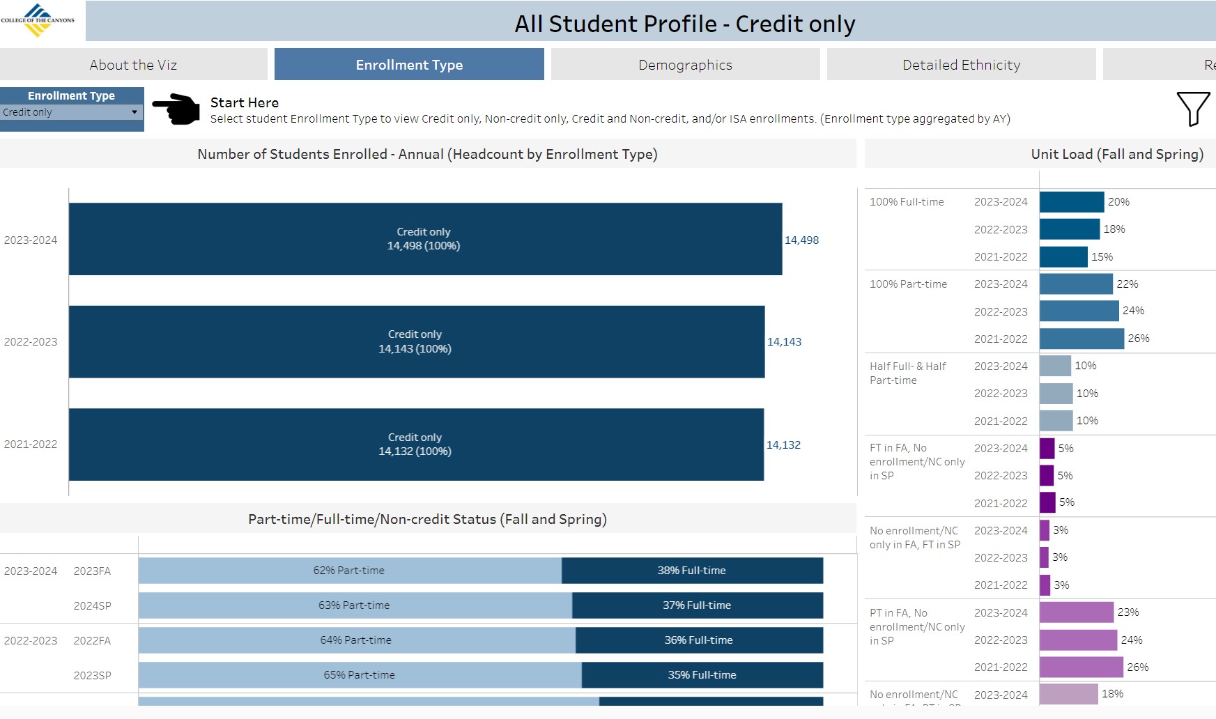
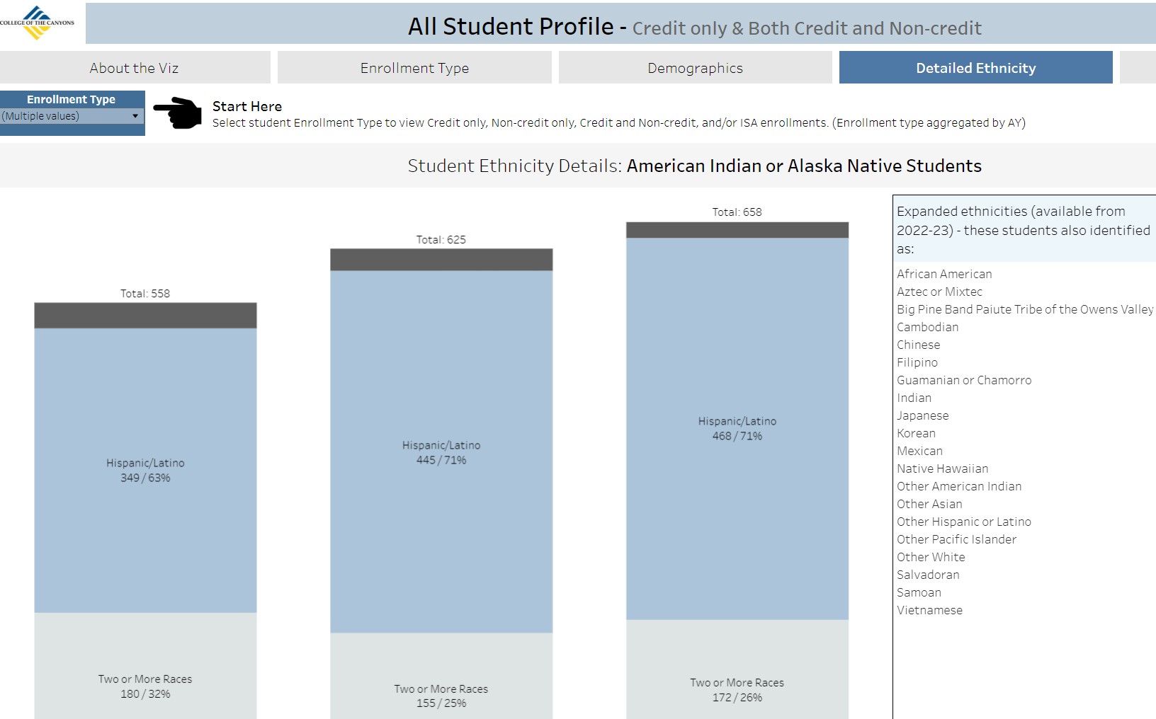
Year over year comparison of enrolled students by headcount. Includes information on enrollment type, demographics, detailed ethnicity, and residence. Option to view students by enrollment type of credit only, credit and noncredit, noncredit only, and/or ISA. Includes enrollment type filters (mode, location, OER, admit status, etc.) and special populations data. Data are refreshed in November during annual program review refresh for the preceding academic year.
Fall Student Profile
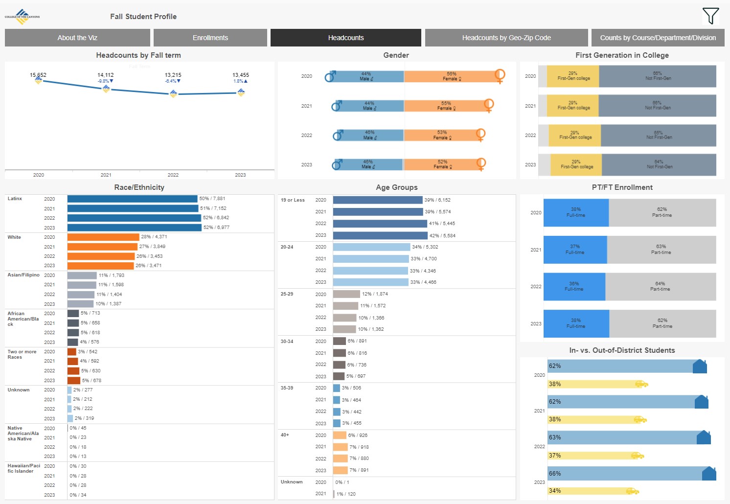
Year over year comparison of demographics by student headcount and enrollments (duplicated) by full-/part-time status, special populations and student geographic location by zip code. Data are refreshed in January for the preceding fall. Excludes ISAs, and students in noncredit, non-graded sections and Noncredit Hybrid sections.
Faculty vs. Student Demographics
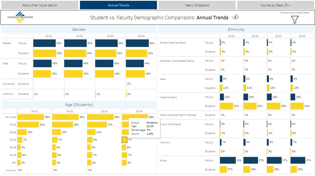
Comparison of demographics (Gender and Race Ethnicity) for teaching Faculty vs. students enrolled. Refreshed annually in the fall for the prior academic year.
Student Ethnicity Detail
Presents details of student race/ethnicity to indicate the number of single-race/ethnicity students among African American/Black, Native American/Indigenous, Hawaiian/Pacific Islander, or Filipino/a/x students in comparison to students who select these as one of their racial/ethnic identities.
Program Review Success/Retention Overview
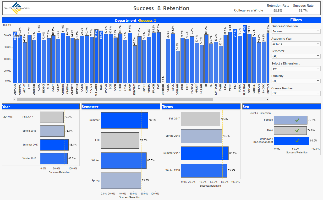
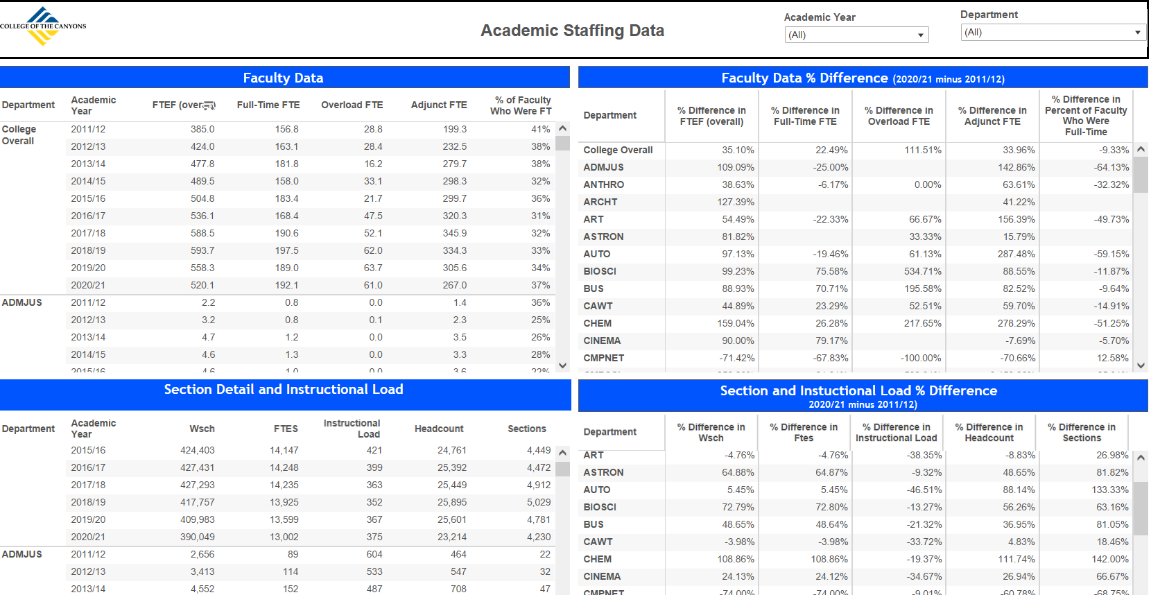
This visualization provides data on elements required for program review. Course success and retention rates, department details (FTE, sections, load etc.), Awards (degrees/certificates) and Programs of study (Majors across fall terms).
Data are refreshed annually in September when data are complete for the preceding academic year (summer through Spring terms).
Video Tutorials:
Success/Retention Data For Fall Terms
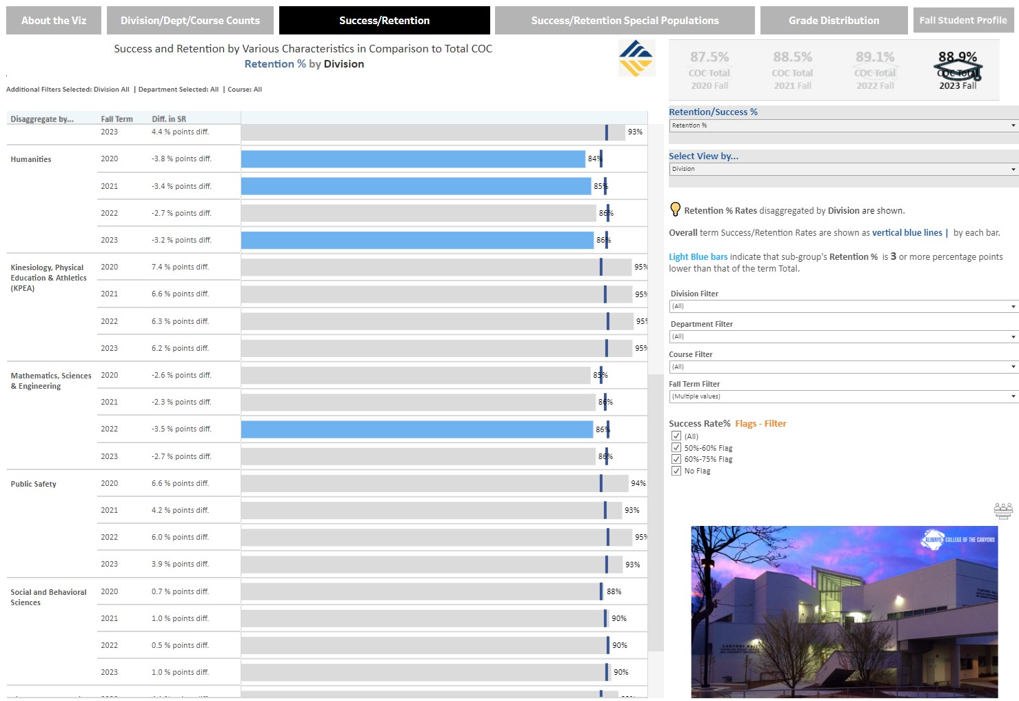
This visualization provides fall-term data starting in 2017 on success rates, retention rates, grade distributions and enrollments (including headcounts). The data can be filtered by School, Dept, Course, location (online vs. on-ground), Race/Ethnicity, financial aid and special populations.
Data are refreshed annually in January when course, special populations data are complete for the preceding fall term. Financial Aid data are not refreshed until the subsequent summer as it is an annual report.
Program Review Visualization for
Personal & Professional Learning
This visualization is limited to Personal Professional Learning (noncredit) data on elements required for program review such as Course success, Awards (degrees/certificates) and Programs of study (Majors across fall terms). Data are refreshed annually in September when data are complete for the preceding academic year (summer through Spring terms).
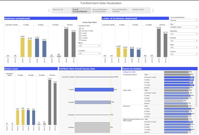
Full/Short-Term Courses Success/Retention Data
This visualization provides data Course success and retention rates comparing
full-term (16-week) offerings to short-term courses. Data are refreshed annually in September
when data are complete for the preceding academic year (Summer through Spring terms).
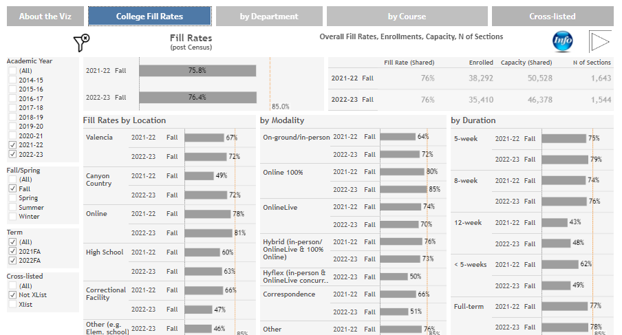
Program Review Fill Rates
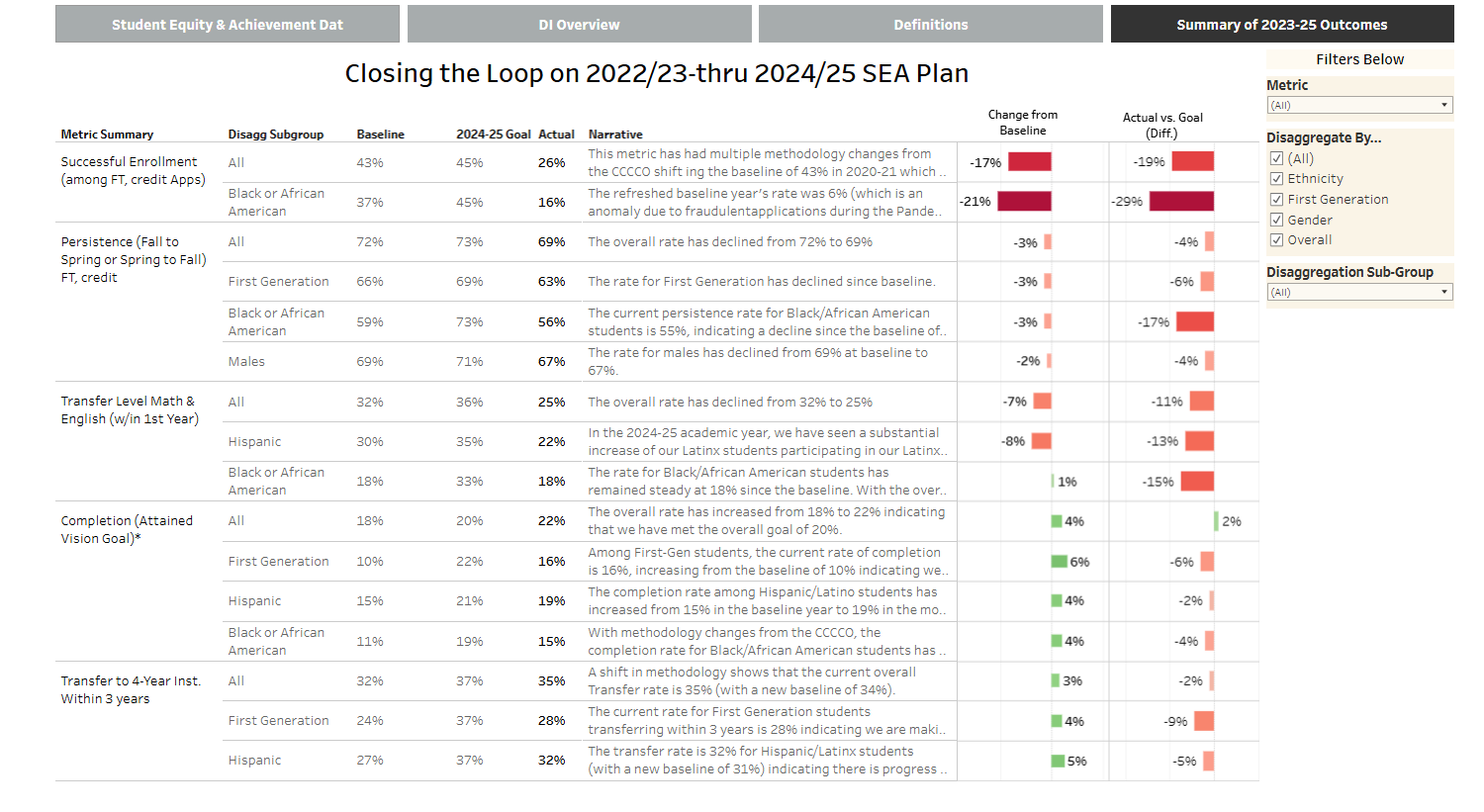
Student Equity & Achievement Data
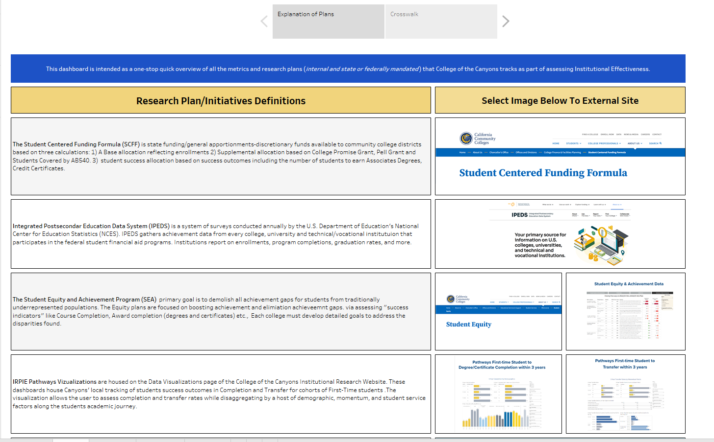
Integrated Planning Crosswalk (SEA, SCFF, IPEDS, etc.,)
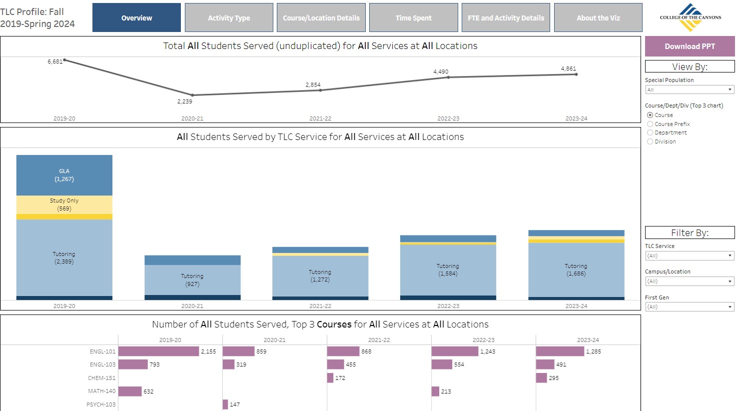
The Learning Center
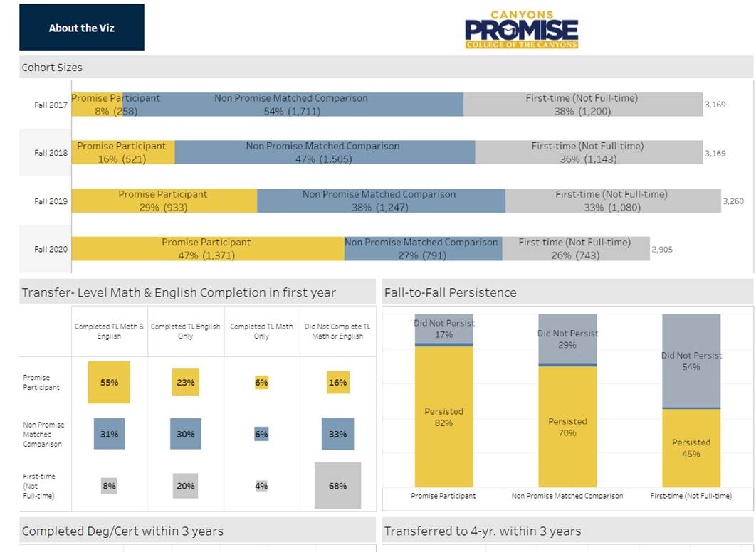
Canyons Promise
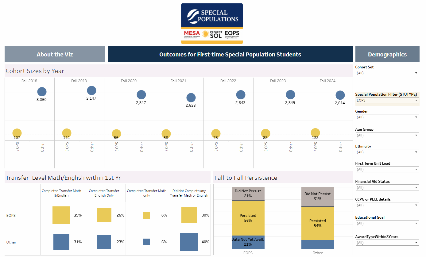
Special Populations
Intercultural Center Programs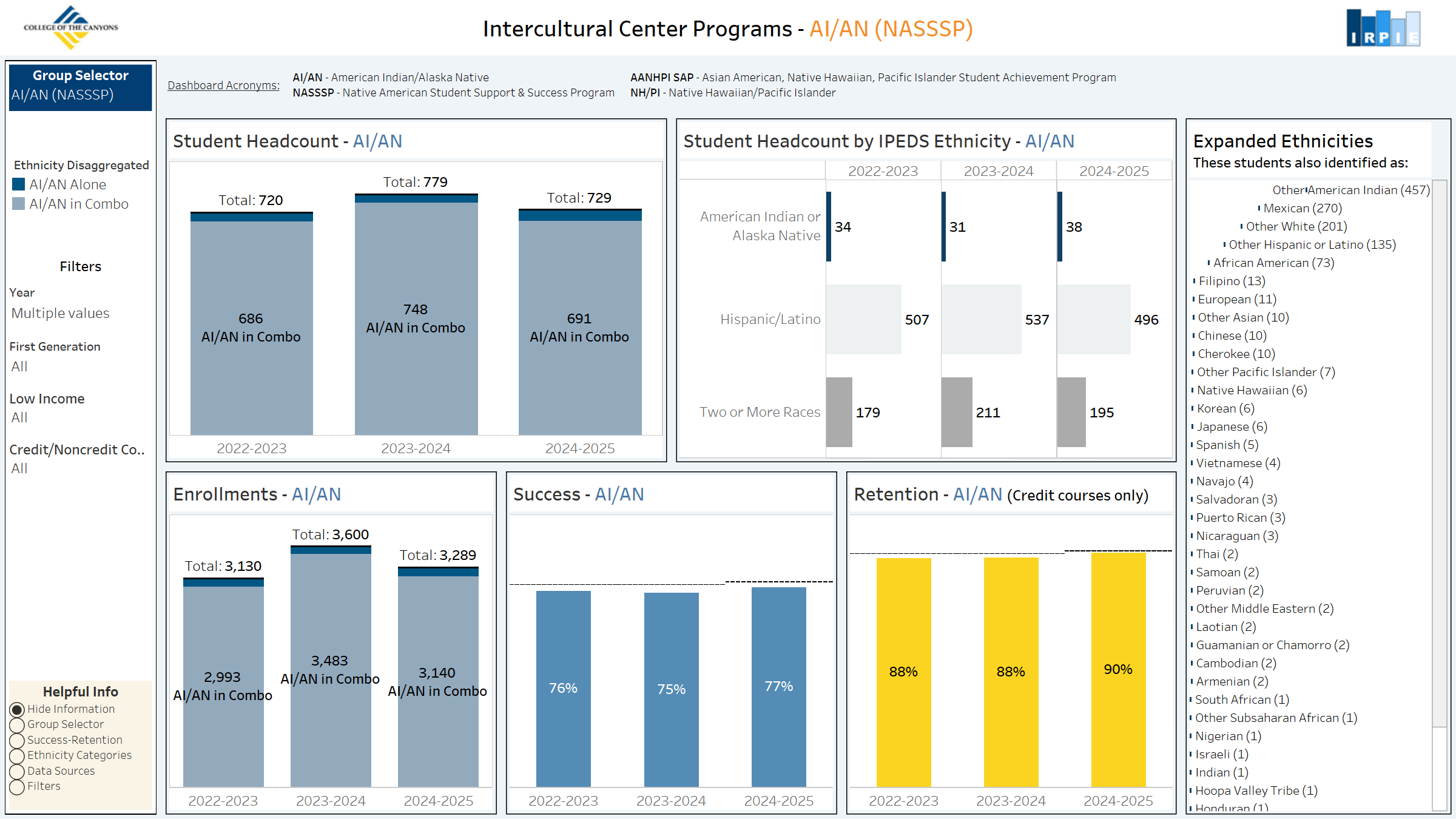
Canyons Connects
Coming soon!

 My Canyons
  Canvas
