
 Resources
 Campus Life
 Just for you


 My Canyons
  Canvas

Outlook Email
Accessible Outlook Email Resources
In this resource, you will learn how to work with the Accessibility Checker to tackle accessibility issues while you're writing your email message. You'll also learn how to add alt texts to images so that people using screen readers are able to listen to what the image is all about. You can also read about how to use fonts, colors, and styles to maximize the inclusiveness of your email messages before sending them.
In this resource:
- Check accessibility while you work in Outlook
- Avoid using tables
- Use built-in headings and styles
- Create paragraph banners
- Add alt text to visuals
- Add accessible hyperlink text and ScreenTips
- Use accessible font format and color
- Create accessible lists
- Adjust space between sentences and paragraphs
- Request accessible email
- Test accessibility with Immersive Reader
Check accessibility while you work in Outlook
The Accessibility Checker is a tool that reviews your content and flags accessibility issues it comes across. It explains why each issue might be a potential problem for someone with a disability. The Accessibility Checker also suggests how you can resolve the issues that appear.
In Outlook, the Accessibility Checker runs automatically in the background when you're composing an email. If the Accessibility Checker detects accessibility issues, a MailTip will provide a convenient nudge to review and correct the issues before sending your email.

In Outlook, you can define how the accessibility notifications and Accessibility Checker work. Select File > Options > Accessibility and select if you want to see accessibility notifications through a MailTip while you work, in certain scenarios, or only when you manually launch the Accessibility Checker.
The default option is to show accessibility notifications in certain scenarios. If any accessibility issues are detected, a MailTip appears to guide you to review suggestions and fix the issue.
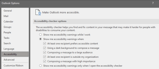
The following options are available:
- Show me accessibility warnings while I work
- Show me accessibility warnings when:
- At least one recipient prefers accessible content
- Using a dark background to compose a message. If you're composing in Black Theme with dark mode enabled, which is the default for this theme, the Accessibility Checker runs but shows notifications only when text contrast is insufficient. Any other issues will still appear in the Accessibility pane, but they won't cause the MailTip to appear.
- Composing a message to a large audience
- At least one recipient is outside my organization
- Composing a message with high importance
- Show me accessibility warnings only when I open the accessibility checker
To manually launch the Accessibility Checker, select Review > Check Accessibility. The Accessibility pane opens, and you can now review and fix accessibility issues.
Avoid using tables
In general, avoid tables if possible and present the data another way, like paragraphs with headings and banners. Tables with fixed width might prove difficult to read for people who use Magnifier, because such tables force the content to a specific size. This makes the font very small, which forces Magnifier users to scroll horizontally especially on mobile devices.
If you have to use tables, use the following guidelines to make sure your table is as accessible as possible:
- Avoid fixed width tables.
- Make sure the tables render properly on all devices, including phones and tablets.
- If you have hyperlinks in your table, edit the link texts, so they make sense and don't break mid-sentence.
- Make sure the email is easily read with Magnifier. Send the email draft to yourself and view it on a mobile device to make sure people won't need to horizontally scroll the email on a phone, for example.
- Use table headers.
- Test accessibility with Immersive Reader.
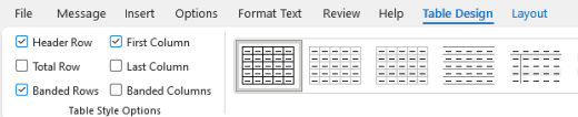
Use table headers
Screen readers keep track of their location in a table by counting table cells. If a table is nested within another table or if a cell is merged or split, the screen reader loses count and can't provide helpful information about the table after that point. Blank cells in a table could also mislead someone using a screen reader into thinking that there is nothing more in the table. Use a simple table structure for data only and specify column header information. Screen readers also use header information to identify rows and columns.
To ensure that tables don't contain split cells, merged cells, or nested tables, use the Accessibility Checker.
- Place the cursor anywhere in a table.
- On the Table Design tab, in the Table Styles group, select the Header Row checkbox.
- Type your column headings.
Use built-in headings and styles
Headings are meant to be scanned, both visually and with assistive technology. Ideally, headings explain what an email section is about. Use the built-in heading styles and create descriptive heading texts to make it easier for screen reader users to determine the structure of the message and navigate the headings.
Organize headings in the prescribed logical order. For example, use Heading 1 and then Heading 2. Organize the information in your email into small chunks. Ideally, each heading would include only a few paragraphs.
For the step-by-step instructions on how to use the headings and styles, go to Format email messages with Styles.
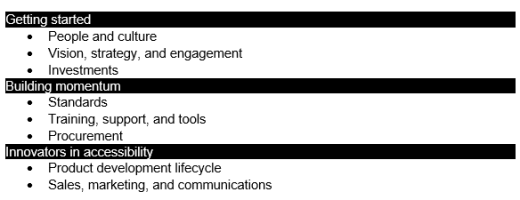
Create paragraph banners
In addition to using headings to organize the content in your email message, you can also create paragraph banners. In a paragraph banner, the background color block extends across the width of the email message and highlights the text within the banner. This is a great alternative to tables to organize and separate content.
- Select your text.
- Select the Format Text tab.
- In the Paragraph group, select (Shading), and then select the color you want.
Add alt text to visuals
Alt text helps people who can't see the screen to understand what's important in images, shapes, SmartArt graphics, charts, and other visuals. In alt text, briefly describe the image and mention its intent. Screen readers read the text to describe the image to users who can't see the image.
For the step-by-step instructions on how to add alt text, go to Add alternative text to a shape, picture, chart, SmartArt graphic, or other object.
For more info on how to write alt text, go to Everything you need to know to write effective alt text. Visual content includes pictures, SmartArt graphics, shapes, groups, charts, embedded objects, ink, and videos.
To find missing alternative text, use the Accessibility Checker.
Notes:
- For audio and video content, in addition to alt text, include closed captioning for people who are deaf or hard of hearing.
- Avoid using text in images as the sole method of conveying important information. If you must use an image with text in it, repeat that text in the email message.
Add accessible hyperlink text and ScreenTips
People who use screen readers sometimes scan a list of links. Links should convey clear and accurate information about the destination. For example, avoid using link texts such as "Click here," "See this page," "Go here," or "Learn more." Instead include the full title of the destination page. You can also add ScreenTips that appear when your cursor hovers over text or images that include a hyperlink.
Tip: If the title on the hyperlink's destination page gives an accurate summary of what's on the page, use it for the hyperlink text. For example, this hyperlink text matches the title on the destination page: Create more with Microsoft templates.
For the step-by-step instructions on how to create hyperlinks and ScreenTips, go to Create or edit a hyperlink.
Use accessible font format and color
An accessible font doesn't exclude or slow down the reading speed of anyone reading an email message, including people with low vision or reading disability or people who are blind. The right font improves the legibility and readability of the email messages.
For instructions on how to change the default font, go to Change or set the default font in Outlook.
Use accessible font format
To reduce the reading load, select familiar sans serif fonts such as Arial or Calibri. Avoid using all capital letters and excessive italics or underlines.
A person with a vision disability might miss out on the meaning conveyed by particular colors. For example, add an underline to color-coded hyperlink text so that people who are colorblind know that the text is linked even if they can't see the color. For headings, consider adding bold or using a larger font.
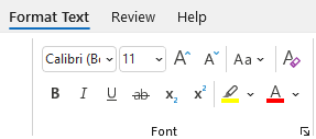
- Select your text.
- Select the Format Text tab.
- In the Font group, which provides options for font type, size, style, and color, select your formatting choices.
Use accessible font color
The text in your email should be readable in a high contrast mode. For example, use bright colors or high-contrast color schemes on opposite ends of the color spectrum. White and black schemes make it easier for people who are colorblind to distinguish text and shapes.
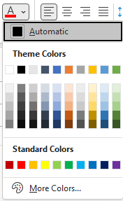
To ensure that text displays well in a high contrast mode, use the Automatic setting for font colors. To find insufficient color contrast, use the Accessibility Checker.
- Select your text.
- Select Message.
- In the Font group, select (Font Color).
- Select Automatic.
Create accessible lists
To make it easier for screen readers to read your email, organize the information in your email into small chunks such as bulleted or numbered lists.
For the step-by-step instructions on how to create lists, go to Add a numbered or bulleted list to a message.
Adjust space between sentences and paragraphs
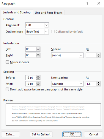
People who have dyslexia describe seeing text "swim together" on a page (the compressing of one line of text into the line below). They often see text merge or distort. To reduce the reading load, you can increase white space between sentences and paragraphs.
- Select your text.
- Select the Format Text tab.
- In the Paragraph group, in the lower-right corner of the group, select the dialog box launcher button to expand the group. The Paragraph dialog box opens, showing the Indents and Spacing tab.
- Under Spacing, select the spacing options you want and then select OK.
Request accessible email
Let people who send you email know that you prefer to receive accessible content.
- To go to your account details on the web, in Outlook, select File > Info, and then in Account Settings, click the link under Access this account on the web. Outlook on the web opens in your browser.
- In Outlook on the web, to go to Accessibility Settings, select
 > View all Outlook settings > General > Accessibility.
 - To request accessible content, select the Ask senders to send content that's accessible checkbox. Then close the Settings window.
Test accessibility with Immersive Reader
Try reading the email with Immersive Reader to check how it sounds like.
- In your email message, select Message > Immersive Reader.
- On the Immersive Reader tab, select Read Aloud.
- To exit Immersive Reader, select Close Immersive Reader.